Jan 16 2009

PowerPoint Color Transparency Tip

By removing the white background from an image, you can layer one image on top of another graphic.

By removing the white background from an image, you can layer one image on top of another graphic.

When you’re working with picture images in PowerPoint, you may want to remove unnecessary parts of an image so that you can see other graphics behind it. If the image in question is a vector image (e.g., WMF), it may be very easy to customize the clip art image. However, if the image is a bitmap image (e.g., PNG, JPG, GIF), then you cannot simply “ungroup” the image and edit it as you want. If you own Photoshop and you’re proficient with it, this task may be fairly straightforward for you. However, many business users don’t have access to this expensive photo editing software or if they do, they may not know how to use it. Continue reading “PowerPoint Color Transparency Tip”

Tags: , , , , , , , , , , ,


Dec 17 2008

How to Create a Sexy Curved Arrow in PowerPoint

When you’re trying to highlight a key part of a chart or table, you may want to use an arrow. It’s fairly easy to create an arrow in PowerPoint 2007, but it is not as obvious how to create an eye-appealing curved arrow. I find that curved arrows are frequently better than straight arrows because they can bend around other important data points in a chart or table rather blocking them. And let’s face it — straight arrows are very boring. Continue reading “How to Create a Sexy Curved Arrow in PowerPoint”

Tags: , , , ,


Nov 24 2008

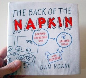
Book Review: The Back of the Napkin

The Back of the Napkin by Dan Roam

The Back of the Napkin by Dan Roam

The Back of the Napkin: Solving Problems and Selling Ideas with Pictures, written by Dan Roam, is a bold effort at introducing business people to using visual thinking principles to solve problems and communicate more effectively. Visual thinking is something that I feel I excel at; however, I know it has been a challenge for many of my co-workers, managers, and clients. Even if you don’t struggle with visual thinking, I recommend The Back of the Napkin (four of five stars) as it provides a valuable set of processes and frameworks that can even benefit experienced visual thinkers, who probably operate more by intuition than methodology. Continue reading “Book Review: The Back of the Napkin”

Tags: , , , , , , ,


Nov 01 2008

PowerPoint Design Principle #1: Consistency

Are your slides consistent like clockwork? (c)iStockphoto/Sabrina Dei Nobili

Too frequently business presentations resemble a rough mishmash of different colors, fonts, and formats. If these slides were a meal, the variety of options on your plate would leave you with some level of indigestion. If you want to enhance the professional look and feel of your slides, you should ensure they are consistent. Continue reading “PowerPoint Design Principle #1: Consistency”

Tags: , , , , , , , ,


« Previous PageNext Page »