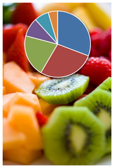
By default PowerPoint or Excel 2007 will create multicolored pie charts or single-colored bar charts. Unfortunately, these default color combinations can cause charts to communicate less effectively unless they are modified.
In most cases, when you’re using charts in PowerPoint slides you’re trying to highlight a specific data point or a subset of data points:
- “Look at how much higher the revenue is for this product”
- “See how the average for this country is much lower than those of other countries”
- “Notice how the quality score of this product is practically the same as those of other cheaper products” Continue reading “How Colors Can Make Your PowerPoint Charts More Digestible”


