On the first and second days, I covered consistency and the actual bullets. Now I’m going to turn my focus to bullet point layout and structure. Before I dive into this area, take a moment to think about your desk. What does it look like? Is it cluttered or clean?
I fall into the much maligned and misunderstood “messy desk” minority. Just because my organization approach doesn’t conform to social norms doesn’t mean I can’t find things (or at least the general vicinity of those items). My approach makes sense to me. Co-workers criticize my desk because they don’t understand my organization approach (JD!). However, if I ever needed someone to find something on my desk for me, that’s when I might be in trouble.

No more sloppy bullet points!
This same challenge applies to sloppy layout and structure when it comes to bullet points. You know your content — it all makes sense to you. You can see past any layout problems. However, if your bullet points are poorly laid out or structured, your audience may struggle to follow your key points. There are several ways in which the layout or structure of bullet points can break down:
- Indents
- Justification
- Line spacing
- Ragged edges and widow/orphan lines
- Single bullets
- Extra spaces
Indents
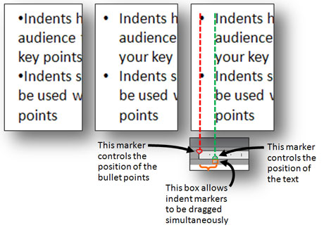
By default most content placeholders in slides have indentation built-in. However, text boxes sometimes don’t provide any indentation depending on the template you’re using. If you use bullet points (especially long ones) without indents then the bullet points become hidden in the text (see example on left below). Try to add just enough indentation so that the bullet points stand out but aren’t too distant that they become disconnected from the text.

Indents make it easier to read bullet points. You can use the Ruler and its indent markers to adjust the indentation of your bullets.
Justification
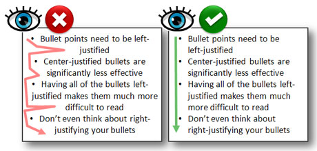
It’s quite common to see presenters carelessly center-justify their bullet points and nullify their effectiveness. It’s harder for the eye to follow center-justified bullets (see below). What can I say? Bullet points are left-wing communists – they only work when they’re left-justified.

Left-justified bullets are easier to read and follow.
Line spacing

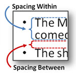
Take control of the spacing within and between lines.
There are two areas where line spacing may need to be adjusted – spacing within bullet points and spacing between bullet points. Many presenters insert empty lines to break up bullets, but this approach typically inserts too much space between bullet points. This lazy technique disconnects the bullet points from each other (a whole line is usually too much space) and can sometimes force presenters to use smaller font sizes to squeeze everything into a slide.

When you use blank lines to space out bullet points, it limits the font size you can use (each blank line increases in size as the font size increases). On the left, I could only use a 24 pt. font before the text could not fit on the slide. By using PowerPoint's line spacing features effectively, you can space out the lines and also use a bigger font size (36 pt. font compared to 24 pt. font).
In the case of multi-line bullet points (see below), you should reduce the spacing within so that it is easier for your audience to know which lines are associated with each bullet point. In another article, I review how to manage spacing between and within lines using PowerPoint 2007’s line spacing options.

Proper line spacing can make your multi-line bullet points easier to read.
Ragged edges and orphan/widow lines
When you use bullet points, you want to ensure they are easy to read and use limited space efficiently. Borrowing from the best practices of desktop publishing, you want to watch out for awkward ragged edges and orphan/widow lines.
With most bullet points being left-justified, you’re going to have a ragged edge along the right side. Generally, you want to ensure the lines are about the same size or reducing in size from the first line. Occasionally, you’ll notice a line sticking out awkwardly or an unusual gap between lines, which will need some attention in order to be easier to read.
Orphan/widow lines occur when a single word falls to another line. If possible, you want to eliminate the orphan or widow words as they can waste precious space on your slide, forcing you to use a smaller font size.
There are two approaches for fixing these problems:
- Rewrite the copy to reduce the number of words
- Resize the width of the text box to accommodate more or less words per line

On the left, we have an awkward ragged edge and orphan line. On the right, you can see how adjusting the width of the text box can eliminate the ragged edge or remove an orphan line. Rewriting the line can also fix these problems.
Single bullet points
We’re all programmed to automatically use bullet points in PowerPoint. In fact, the program pushes us to use bullet points for better or worse. However, if you’re only going to convey one idea on a slide, I’d recommend refraining from using a single bullet point and just convert it into a slide title, sentence, or phrase.
Like the Beatles, bullet points perform better as a group rather than as solo artists. Solitary bullet points look odd, and also give an impression that you’re at the mercy of PowerPoint defaults. Who wants to leave that type of impression with an audience? Definitely not a PowerPoint ninja.
Extra spaces

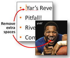
Take time to remove extra spaces from your PowerPoint slides and celebrity smiles!
I may not be a “neat freak” when it comes to my desk, but I do strive to remove extraneous spaces at the beginning of bullet point text. These spaces usually occur as you are editing your content and as you run into indentation problems. For example, you might substitute a few spaces for missing indents as you’re building your slides, and then fail to remove them later once you’ve got the right indents in place. Take some time to delete these annoying spaces in your PowerPoint presentation. It’s a relatively easy process compared to what gap-toothed celebrities like Michael Strahan, Madonna, and David Letterman would have to go through to remove their “extra” spaces.
Final Words
Individually, all of these layout or structural problems may seem small or insignificant. As a presenter, remember that you see your presentation through the lens of knowing your content thoroughly (see curse of knowledge in Made to Stick). Give your audience the best chance possible to understand and apply your ideas by removing unnecessary interference caused by layout and structural problems.
One final comment on the messy desk debate, I like what Albert Einstein supposedly stated, “If a cluttered desk is a sign of a cluttered mind, then what are we to think of an empty desk?” I feel like I’m in good company with Albert.
Get ready for day four of Bullet Point Boot Camp where we’ll focus on the usage and text density considerations related to bullet points, which might be a little more controversial than the last few days of Bullet Point Boot Camp.


October 28th, 2009 12:17 pm
Once again! This is extremely helpful for encouraging my students to consider design principles when they are learning how to use the bullets, ruler indents and line spacing tools in PowerPoint.
December 2nd, 2011 10:40 am
I’m wondering if there’s a way to adjust the vertical positioning of a bullet point in ppt. When I enlarge the % of the bullet to the text ie; 200% is shifts it up, not centered on the text. Thoughts?
December 24th, 2011 12:15 pm
I recommend finding a bullet that is larger in size rather than ever enlarging by %. If you use a larger bullet point to begin with, you won’t run into the issue where it isn’t centered on the line (personal pet peeve of mine). I frequently see lazy PowerPoint templates where the designer has simply increased or decreased the size of the bullet, but they don’t realize that by changing the size of the bullet, it will no longer be centered with the line. If you explore the different symbols you’ll see there are squares, arrows, and circles of different sizes. If you need a larger bullet, never use the % adjustment. Find a bigger symbol for the bullet.
March 12th, 2012 5:10 pm
In any real design program, you can adjust the distance of any type element above the baseline. That it is impossible to do this in PowerPoint just shows how limited this program is.