On the first and second days, I covered consistency and the actual bullets. Now I’m going to turn my focus to bullet point layout and structure. Before I dive into this area, take a moment to think about your desk. What does it look like? Is it cluttered or clean? Continue reading “Bullet Point Boot Camp – Day Three”
Sep 15 2009
Bullet Point Boot Camp – Day Two

Like makeup, bullet points should be noticeable but not distracting.
On the first day of Bullet Point Boot Camp, I covered consistency in relation to bullet points. Before we get into more meaty topics surrounding bullet points, I didn’t want to ignore the actual bullet points themselves and how they can become problematic if you’re not careful with them.
Like make-up, the actual bullet points in your presentation should be noticeable but not distracting. You want people to be able to easily scan your main points and not be diverted by dysfunctional bullet points. Continue reading “Bullet Point Boot Camp – Day Two”
Sep 12 2009
Bullet Point Boot Camp – Day One

Please keep Corporate America beautiful -- no bullet points!
Most presentation experts like Seth Godin and Cliff Atkinson are not big fans of bullet points. In fact, every time someone uses bullet points in a presentation slide, I believe Seth Godin sheds a tear. Many of these experts have initiated a “bullet point” backlash – advocating for a more visual approach with less text. This visual approach is really well-suited to strategic presentations (e.g., keynotes). However, most tactical presentations – the everyday variety that we see multiple times each week at work – depend more heavily on bullet points. Continue reading “Bullet Point Boot Camp – Day One”
Aug 31 2009
PPTNinja.com — First Year Blogiversary!
It’s hard to believe that a year has passed since my very first article in which I compared PowerPoint presentations to sushi. Since then I churned out sixty-five more articles over the course of several late nights and weekends (no more Xbox Live). I’ve enjoyed blogging a lot and look forward to adding more articles in the future as long as my wife and kids allow me to. Continue reading “PPTNinja.com — First Year Blogiversary!”
Aug 24 2009
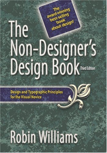
Book Review: The Non-Designer’s Design Book
The Non-Designer’s Design Book (Third edition) by Robin Williams – not to be confused with the famous comedian by the same name – provides “design and typographic principles for the visual novice.” Although this book does not focus on PowerPoint presentations at all (mainly desktop publishing examples – business cards, brochures, newsletters, etc.), many of her design principles are transferable to the PowerPoint world. I became interested in reading this book when Garr Reynolds referenced her in his Presentation Zen book. Continue reading “Book Review: The Non-Designer’s Design Book”
« Previous Page — Next Page »


