Apr 27 2010

What Makes an Image Good for Presentations – Part I

Lots of photos are taken, but few are chosen. (c) Thinkstock

Lots of photos are taken, but few are chosen. (c) Thinkstock

If you’ve read any presentation design books lately (Presentation Zen Design, Slide:ology, etc.), you’ve probably decided to use more images in your presentations. However, you may still be wondering if the images you’re selecting are good, average, or lame. Using more lame or average images in your presentations is about as helpful as adding more bullet points or animations to your PowerPoint slides. Continue reading “What Makes an Image Good for Presentations – Part I”

Tags: , , , , , , ,


Feb 15 2010

How to Create a Sexy Curved Arrow in PowerPoint – Part II

More work

Add a tapered "swoosh" arrow to your slides.

Back in December 2008, I published an article on how to create “sexy” curved arrows in PowerPoint 2007. I never thought that particular post would become one of my most popular articles. It highlights a problem within PowerPoint 2007 where you can no longer edit and curve the default arrows. The article shows you a workaround approach that enables you to create a nice flowing — dare I say “sexy” — curved arrow in PowerPoint 2007.

In this Part II article, I’d like to add to your curved arrow technique to your PowerPoint design toolbox — the curved swoosh arrow. It’s a little more work to create than the “standard” sexy curved arrow, but I think the effect might be worth the extra effort in some situations. Continue reading “How to Create a Sexy Curved Arrow in PowerPoint – Part II”

Tags: , , , , , ,


Jan 31 2010

PowerPoint SmartArt is Dumb

Theres no Bob Ross feature in PowerPoint to guide you through the process of visual communication.

SmartArt is not PowerPoint + Bob Ross.

PowerPoint is often criticized for encouraging presenters to rely too heavily on bullet points and not helping people to communicate more visually. Microsoft added a feature known as SmartArt to help convert text into various stylized graphics. When you’re designing your PowerPoint presentation, you can quickly rotate through various shapes, colors, layouts, and styles in order to find the right graphic for your presentation.

For novice or casual PowerPoint users, SmartArt can be a handy tool for quickly making your presentation more visual and professional looking. If you decide to use SmartArt in your PowerPoint slides, you need to be careful because SmartArt is dumb. Continue reading “PowerPoint SmartArt is Dumb”

Tags: , , , , ,


Apr 16 2009

Free Ninja Clip Art for Your PowerPoint Slides

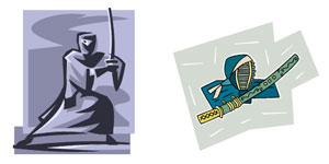
I didn’t comment on another key deficiency in PowerPoint 2007 in my recent “Missing-in-Upgrade” article, but there are only two clip art images that are ninja-related in PowerPoint 2007 (below) — and they’re lame. As the PowerPoint Ninja, I wanted to make sure that this problem is rectified.

sdfsdf

Is the ninja on the left wearing a hooded Snuggie and a man purse? Maybe someone spilled his bowl of Cheetos while he was lounging on the couch in front of the TV and now he's out for blood...or he's just a nerd-ninja.

Continue reading “Free Ninja Clip Art for Your PowerPoint Slides”

Tags: , , , , , , ,


Apr 13 2009

PowerPoint and the Elusive Color Picker / Eye Dropper

An eye dropper tool should be baked into PowerPoint

An eye dropper tool should be baked into PowerPoint

If you’ve used drawing or photo editing applications such as Illustrator or Photoshop, you will be familiar with their color picker or eye dropper tools, which enable you to extract a color from an image so the same color can be added to other objects. I wish PowerPoint offered this same functionality, but alas it doesn’t. Luckily, there are many outside color picker apps that can be leveraged in conjunction with PowerPoint. Continue reading “PowerPoint and the Elusive Color Picker / Eye Dropper”

Tags: , , , , , , , , ,


« Previous PageNext Page »