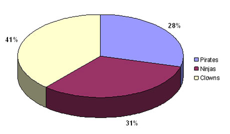
Are your PowerPoint pie charts looking a little tired and stale? Is it time to make your pie chart data stand out? We’ve seen the same basic pie chart design since Office 97.

Look familiar? It's a whole lot of PowerPoint pie chart ugly. Wfffff. I can hear the air going out of your presentation if you're still using pie charts like this one.
In PowerPoint 2007, there are many new shape effects that can help you to produce Photoshop-like results. One such effect is the bevel effect. When you use it in combination with your pie charts you can really add some zing to your PowerPoint presentations. Continue reading “Make Your Pie Charts Pop in PowerPoint 2007”

