If you’ve used slide transitions in PowerPoint, you’ll be happy to know that Microsoft has upgraded the transition effects in PowerPoint 2010. They’re slicker and smoother than the stale ones that you’ve seen in recent versions of PowerPoint. In fact, if you’ve seen any presentations done on Apple’s Keynote presentation software, you’ll recognize some similar effects in PowerPoint 2010 (e.g., the “cube turn” transition). I believe the 19 new transitions were a direct response to Keynote’s more cinematic, professional-looking transition effects, which put to shame PowerPoint’s transition effects. Continue reading “Bedazzling Presentations with New Transitions in PPT 2010”
Feb 22 2011
Layering Technique for PowerPoint Objects

I love layers when it comes to parfait and PowerPoint. (c) Brand X / Thinkstock
Layering can be a useful technique and a potential shortcut in PowerPoint. You can use the order of the objects to create different visual effects that would be difficult or impossible to create by other means. Part of being a PowerPoint ninja is recognizing when a time-saving shortcut is the best approach.
Sometimes building a PowerPoint slide is like building a movie set. You don’t need to build a perfect replica of an entire Mayan temple — just a passageway and a few walls that will be a backdrop to your hero’s adventures. Movie directors and set designers know that only the visible parts of the set are what matter to the film. In other words, as long as your audience is only viewing your slides in the Slide Show view and it achieves the desired visual effect, it doesn’t matter how you construct the actual slide in PowerPoint.
I’ve used this particular layering trick a few times to hide edges within an object. In this case, I wanted to have arrows pointing inwards within this cloud. I could edit the arrows so that they didn’t overlap with the outline of the cloud objects. However, this would be very time-consuming to do as I would need to be careful to not overlap any of the outline edges.
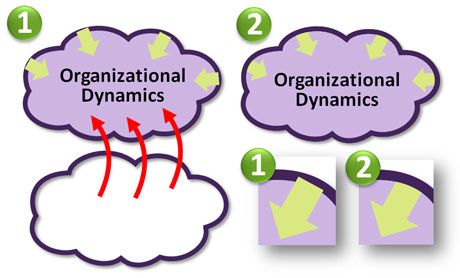
Once I added the arrows, I created a copy of the cloud which I layered on top of the other cloud.
Instead, I created a copy of the cloud image, made its fill transparent, kept the outline the same, and brought it to the front (Home tab > Arrange > Bring to Front). I then roughly adjusted the ends of the arrows so they would be hidden when I placed the transparent cloud directly in front. Essentially, the arrows became sandwiched between the two clouds, and my audience was none the wiser as to how I created the graphic. I’ve used this technique in various ways such as partially filling an object in a different color. Enjoy!
Jan 31 2011
Five Tips for Finding Good Images for Your Next Presentation

Finding the right images can be a time-consuming exercise. (c)Thinkstock
You’ve read Garr Reynolds’ Presentation Zen or Nancy Duarte’s Slide:ology, and you’re energized to start using more images in your PowerPoint presentations. All of the examples in their presentation design books are amazing. They make it look so easy, but you’ve probably found it’s not as easy as it looks. Searching for just the right image can be a time-consuming and sometimes frustrating process.
I thought I’d share some practical tips for finding good images for your next presentation (I’ve also done a two-part article on what makes an image good). There are a couple of different scenarios when you’re searching for images. In some cases, you generally know what you are looking for. For example, I might need a photo of a boat, and it is fairly straightforward to accomplish this task on a stock photography site. However, there are times when you don’t necessarily know the subject of your image and you need inspiration. For either scenario, the following tips will help you to be more effective in your quest for good images for your presentations:
Tip #1 – Try various keywords in your search
When you’re searching for images on a stock photography site (e.g., an image of a boat), I recommend trying different synonyms of the word (e.g., ship), specific types/categories of the word (e.g., yacht, steamboat, canoe, etc.), or related words (e.g., fishing, sailing, cruise, etc.). You might want to use a thesaurus or keyword lists on actual image pages to identify other keywords you can use in your image search.
Most of the stock photos are assigned meta tags by the photographers, and some of them do a better job of tagging their photos than others. You may miss out on a great photo simply because you didn’t use the right keyword in your search. The most obvious keyword may not yield the best results.

These are the metatags for a particular image (found on the image page). You can see what other keywords are being used for the same image and see if there's another keyword that is better than the one you're using.
Tip #2 – Get inspiration from other people (via Google)
If you need an image for a more abstract topic (e.g., teamwork, willpower, or arrogance), you may not know where to begin your image search because you don’t have a specific subject in mind. It can be helpful to see what subjects or approaches other people have used for the same keyword. A quick Google image search can yield some great ideas (Note: you might want to adjust the Safesearch settings so you don’t have potentially embarrassing images showing up on your desktop. Seemingly harmless keywords can turn up some interesting images).
Once you have some inspiration from what other people have done, you can then find specific images on a stock photography site. You need to be careful about just taking images from random sites via Google image searches. First, the images may have copyrights. Second, most of the website images are too small or low resolution to show well in presentations.
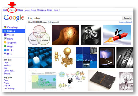
Google Image search can be a great source of inspiration when you're in a hurry or stuck in a creative rut.
Tip #3 – Realize filters are your friends
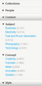
Useful search filters on Thinkstock
Many stock photography sites have introduced advanced search filters that can speed up your image searches and also increase your success rate. Sites such as Thinkstock (Disclaimer: I have received a complimentary subscription from Thinkstock) and iStockphoto have added a variety of useful search filters so that you can better target your searches. For example, on Thinkstock you can narrow down your search for “innovation” images by subject (e.g., “business”), concept (e.g., “ideas”), people (e.g., “no people”), style (e.g., “close-ups”), collections (e.g., Comstock images), etc. In addition, some stock photography sites allow you to apply negative keywords to your searches (e.g., not “light bulbs”). In addition, Boolean filters (AND, OR, NOT) and searching within results can help you to narrow down the thousands of images to a more manageable and targeted set of photos.
Tip #4 – Take full advantage of useful site features
Stock photography sites offer various tools and features that can help your quest for good images. One useful tool is the light box, which enables you to save images to a folder. Sometimes you come across decent images, but you’re not sure if you’re going to find a better image around the corner. It’s a best practice to add the image to your light box so you can easily find it if you decide you really do need it.
Another useful search feature is the ability to expand the number of images per page. Seeing more images at a time can speed up your searching. Finally, every site is going to have unique features, and I really like Thinkstock’s “view similar images” feature, which allows you to see other photos with a similar composition. This feature can come in handy when you’re trying to find a slightly different variation of an image that you’ve already found or a series of similar-looking images for a theme in your presentation.
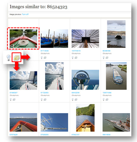
I love the "view similar images" feature on Thinkstock.
Tip #5 – Watch the time clock

Be careful how long you take to find images. You can't get it back once it's gone. (c)Thinkstock
You may be searching for the perfect image – but it’s not jumping out at you. You may be trying the tips mentioned above to find the right image. However, you need to know when it’s time to cut bait and settle for something that may not be ideal or rethink your idea for the image. You can spend hours looking for an elusive, “big bang” image, and still come up empty handed. As I’ve stated many times before, time is the root of all PowerPoint evil. When you carelessly waste your time searching for images, you’re going to have less time to actually build or rehearse your slides. Sometimes a “good enough” image has to be good enough.
Please share any image search secrets that have helped you in the past. An old ninja can still learn a trick or two. Good luck in your future image searches!
Dec 23 2010
Book Review: Resonate by Nancy Duarte
After the success of her first book, Slide:ology, Nancy Duarte provides us with an interesting prequel, Resonate: Present Visual Stories that Transform Audiences. While Slide:ology focused more on the tactics of effective presentation design, Duarte’s Resonate book focuses the strategy or framework behind effective presentations. Although Resonate’s focus is different than Slide:ology’s, I think it covers important material for anyone who builds presentations on a frequent basis. Overall, I give this book four-and-a-half of out of five stars.
Key takeaways from Resonate
In contrast to other presentation design books which have more of an instructional feel, I found Resonate to be more inspirational in nature. Duarte reminded me of what most presentations are striving to achieve – that is change. We’re trying to change either the minds or behaviors of our audiences. We need to have a human connection with our audiences in order to achieve the change we’re striving for.
In order to generate a deep connection with our audiences, Duarte emphasizes the importance of having an emotional appeal in presentations, not just presenting facts and figures. “People rarely act by reason alone. You need to tap into other deeply seated desires and beliefs in order to be persuasive.” I’ve seen many fellow analysts make the mistake of presuming that the data will “speak for itself”. Duarte encourages us to “use emotions as a tool to bring emphasis to the facts so they stand out”, and I’ve also discovered how emotional appeals can really complement data.
A great way to evoke emotional responses from your audience is through the use of storytelling. You build trust and credibility through stories when your audience recognizes that you share similar values, goals, and experiences. Chip and Dan Heath’s Made to Stick first exposed me to the importance and power of stories, and it’s great to see Duarte further expand upon the art and science of storytelling in presentation design. Duarte spends a significant portion of her book deconstructing various stories and speeches to identify the key elements that can be applied to presentations.
One main takeaway was that presenters must identify a conflict or imbalance that their presentation resolves for their audience – contrasting “what is” with “what could be”. Throughout a presentation – in the beginning, middle, and end – you are shifting back and forth between what is and what could be, juxtaposing the two sides to engage your audience and hold their attention.
Duarte also highlights how your audience is the real hero of your story/presentation, and the presenter is simply the storyteller and mentor. I’ve seen some very knowledgeable presenters who were very passionate about their topics — but didn’t care about their audiences. The presenters thought they were the heroes. Duarte declared “passion for your idea should drive you to invest in its communication” and that includes understanding your audience and tailoring your message to them.
Throughout her Resonate book, Duarte does a good job of infusing real-life, interesting examples from all kinds of past and present famous people (e.g., MLK, Leonard Bernstein, Steve Jobs, etc.). In Chapter 7 of Resonate, Nancy Duarte introduces the concept of creating S.T.A.R. moments (Something They’ll Always Remember) within your presentations. She identified five types of these moments and provided interesting examples for each: memorable dramatizations (e.g., a prop, demo, or skit), repeatable sound bites (i.e., slogans), evocative visuals, emotive storytelling, and shocking statistics.
Final Thoughts
Resonate is similar to Slide:ology in terms of being a highly visual, attractive book. However, readers may be a little disappointed that there aren’t as many actual slide examples in Resonate. I believe many people enjoy seeing expertly-designed slides in the other presentation design books such as Slide:ology, Presentation Zen, and Presentation Zen Design. Despite this perceived drawback, Resonate is a great “strategic” design book and a worthy addition to any presenter’s library. Nancy Duarte made me think and re-evaluate my own presentation design style, which I think is a compliment to her new book.
Nov 10 2010
Drawing in PowerPoint 101

Sometimes you need to draw in PowerPoint. (c) Thinkstock
In PowerPoint, you may have discovered that you have the ability to draw objects. Although not as powerful as Adobe’s Illustrator software, PowerPoint 2007 does give you a basic set of drawing options for adding custom objects to your PowerPoint slides. I view drawing in PowerPoint as a last resort when you can’t find an appropriate photo or clip art graphic. If I can customize an existing clip art image, I’m going to go that route before I embark down the path of drawing something in PowerPoint for a couple of reasons. Continue reading “Drawing in PowerPoint 101”
« Previous Page — Next Page »

